One of the main metrics we use to evaluate and showcase performance is the click-through rate (CTR) metric. For this page, we restrict ourselves to widgets. Search and ad CTRs are defined differently and are not currently included in our main documentation.
We define CTR as follows:
CTR = (Total number of widget click events)/(Total number of widget shown events)
It is generally reported as a percentage, so you'd multiply the above ratio by 100 when reporting it.
The three determinants of CTR: recommendation quality and count, placement, and style
CTR is determined by three key factors. The goal is for you to outsource (most of) 1 to LiftIgniter, while retaining control of 2 and 3.
- The selection of recommendations. This is where you use a powerful engine like LiftIgniter. More personalized and contextually relevant recommendations do better. One parameter you can vary is the number of recommendations. In general, more is better, and the ideal range is generally somewhere between 3 and 12 recommendations.
- The placement of the recommendations. In general, a recommendation set will get the highest CTR if it is in front of the user when they are finished with (or bored of) the main thing they came to consume. More details are later in this page.
- The style of the recommendations, including what metadata is displayed. This is covered in more detail in a later section.
Comparing CTR values in an A/B test
The CTR is one of the fairest metrics to use when comparing relative performance in an A/B test between LiftIgniter recommendations and the baseline recommendation system you are testing it against. In the Analytics tab of our dashboard, you'll see graphs of LiftIgniter's CTR (blue, filled solid) and the baseline CTR (orange). If we're doing our job, the blue line will be clearly above the orange line. The percentage lift represents how much we are adding relative to the baseline.
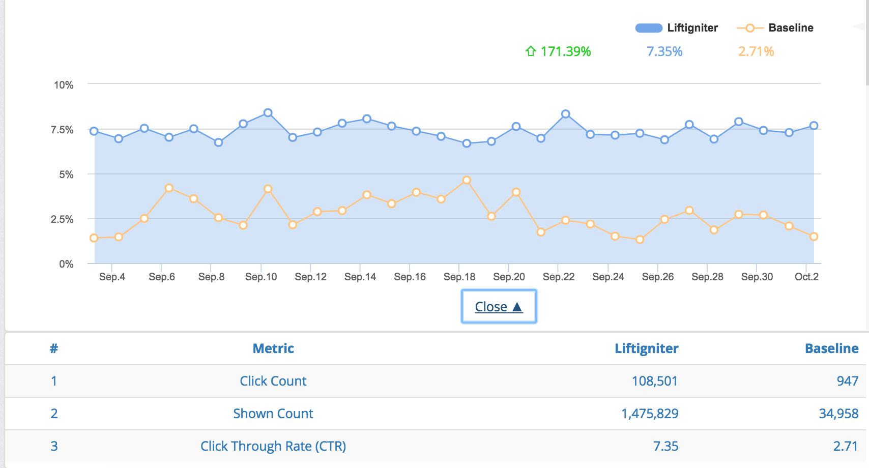
CTR comparison for an A/B test. Note that this is NOT a 50/50 A/B test, as the base slice is much smaller. Data is for a post-trial customer who kept a base slice for continued benchmarking.
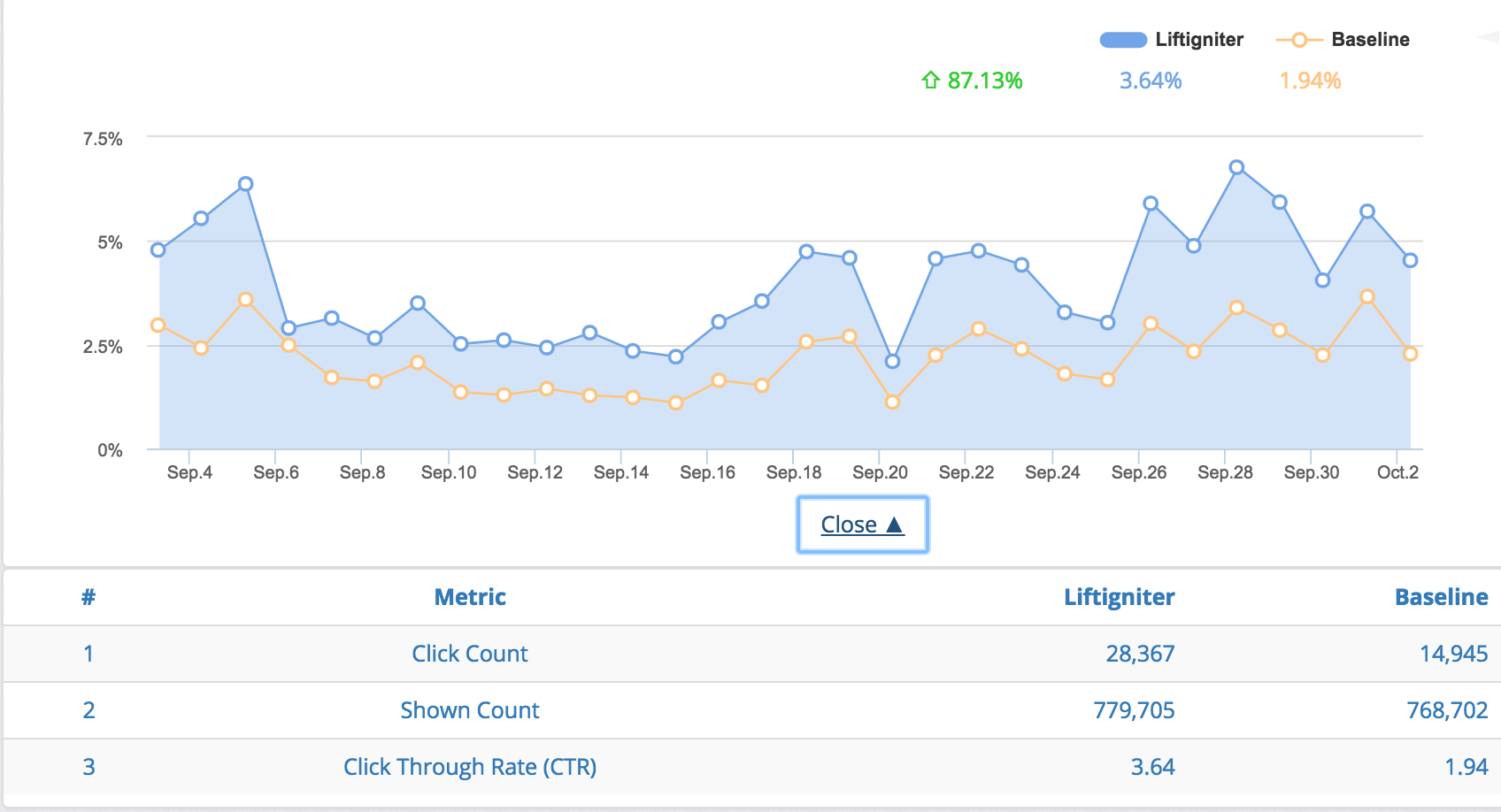
CTR comparison for a 50/50 A/B test.
How the number of recommendations affects CTR
We see that increasing the number of recommendations increases total CTR in the area, as people have more options to choose from. However, the increase is usually less than proportional. For instance, doubling the number of recommendations will increase CTR, but to less than double of the original value. That's because of three reasons:
- Reduced relevance: The top few items we show tend to be the best. So as we increase the number of items, the average quality of the item (for the user context) tends to go down.
- Reduced visibility of items: The more recommendations you put in, the larger the widget gets, and the less likely it becomes that a user sees all the recommendations. For instance, if you are showing 20 recommendations on a right rail for a video, people are likely to see only the top 5 or 6 recommendations that are visible above the fold, so the remaining recommendations aren't that valuable.
- Cannibalization between items: Some users are interested in clicking something but don't have a strong preference regarding what to click. These users, who were anyway predisposed to click, don't become more predisposed to click on seeing more items. For instance, somebody who is keen to read another article, but not too particular about what article to read, may not be that much more likely to click with 6 options than with 3.
The role of placement in determing CTR
The general heuristic for CTR: A recommendation set will get the highest CTR if it is in front of the user when they are finished with (or bored of) the main thing they came to consume. Below are some approximate guidelines.
Below, we have broken this down based on page types.
- Video and slide show pages: Here, consumption happens within the video or slide show screen itself, without scrolling down. Right rails tend to have the highest overall CTRs here. End-of-video and end-of-slideshow recommendations have high CTRs conditional to getting to them, but if completion rates are low then the overall CTRs are likely to be low.
- Article pages: Right rails and location above the article tend to do worst (because of "right rail-blindness" evolved as a result of an abuse of the right rail by ads). The location just below the article gets the best CTR. If the location right below the article shows an external recirculation unit (such as Outbrain or Taboola) and shows the recommendation widget below that, the CTR on the recommendation unit can be fairly low.
- Product pages: The location right below the product's overall description, but above free-form information (such as product reviews) generally does best.
- Home page: In general, locations higher up tend to get more CTR. With that said, home pages have a larger fraction of visits coming from site addicts, who may form their own consumption habits, so things could vary based on the site context.
Breaking down CTR into "visibility" and "VCTR"
CTR = (Total number of widget click events)/(Total number of widget shown events)
One obvious necessary condition for people to click on a recommendation is that they need to see the recommendation. We can therefore break up CTR as follows:
CTR = Visibility * Visible Click-Through Rate (VCTR)
where:
Visibility = (Total number of widget visible events)/(Total number of widget shown events)
and:
VCTR = (Total number of widget click events)/(Total number of widget visible events)
Some of the things we discussed around placement can be seen through the separate measurements of visibility and VCTR. For instance:
- If a recommendation widget is buried below an external recirculation widget, you will see that its visibility is lower, and that this lower visibility explains the lower overall CTR. By removing the external recirculation unit, you will increase visibility while keeping VCTR largely the same.
- End-of-video or end-of-slideshow recommendation units, that become visible only on completion of the video or slideshow, will have a very high VCTR and a low visibility (that depends on the completion rate for the video or slideshow).
However, the reported visibility does not always capture whether the user has seen the recommendation. In particular, right rails and above-the-article report high visibility but low VCTR and CTR. This is because of right-rail blindness as well as because these recommendations are shown "too soon" before people have completed their primary consumption.
In the example below, we see an increase in CTR. Debugging it further, we see that there was an increase in visibility, but no change to VCTR. This suggests that the change was purely a result of a placement change.
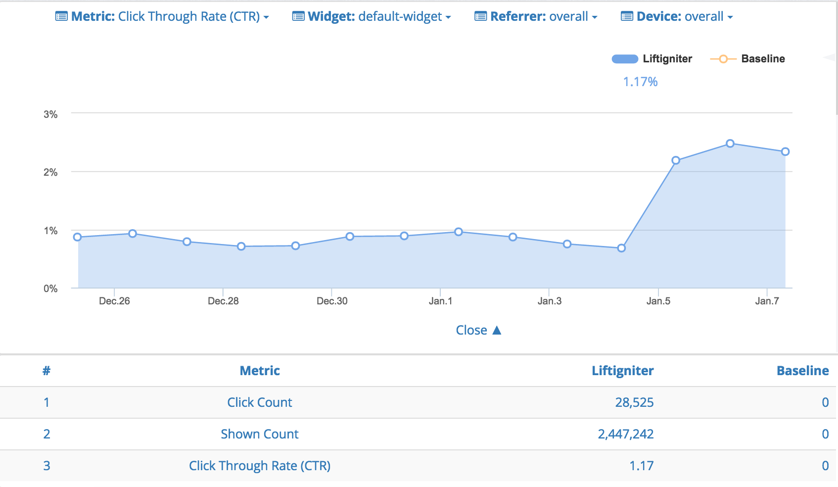
CTR increased sharply on January 5
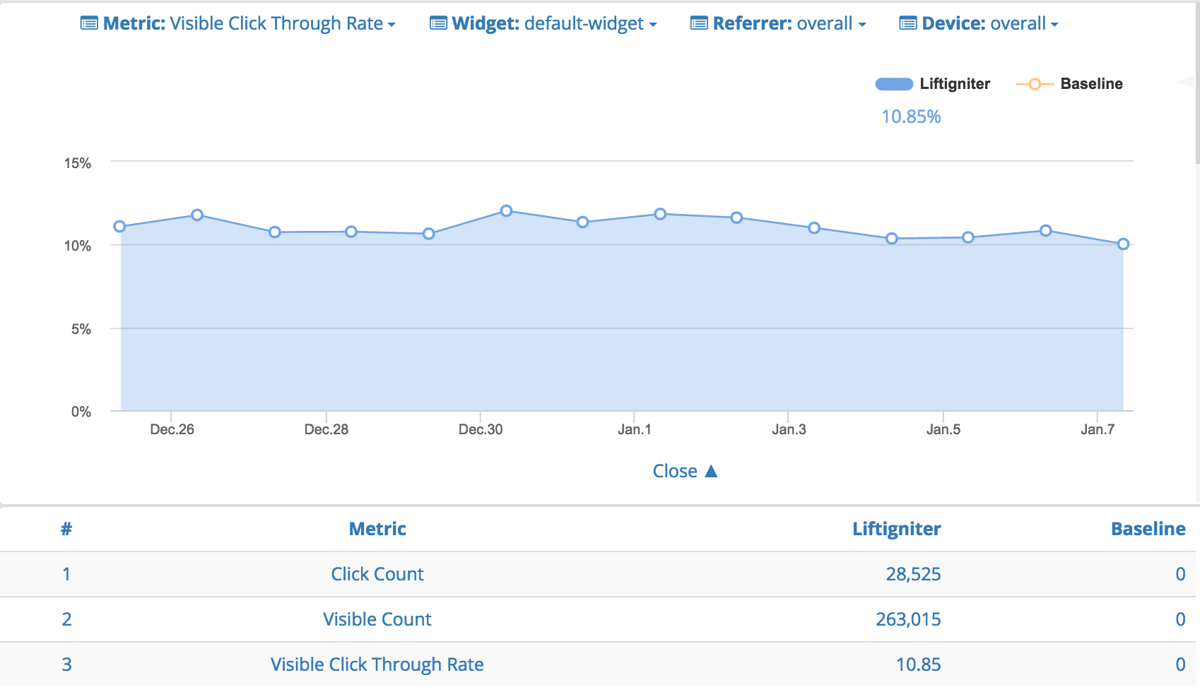
However, VCTR was basically stable.
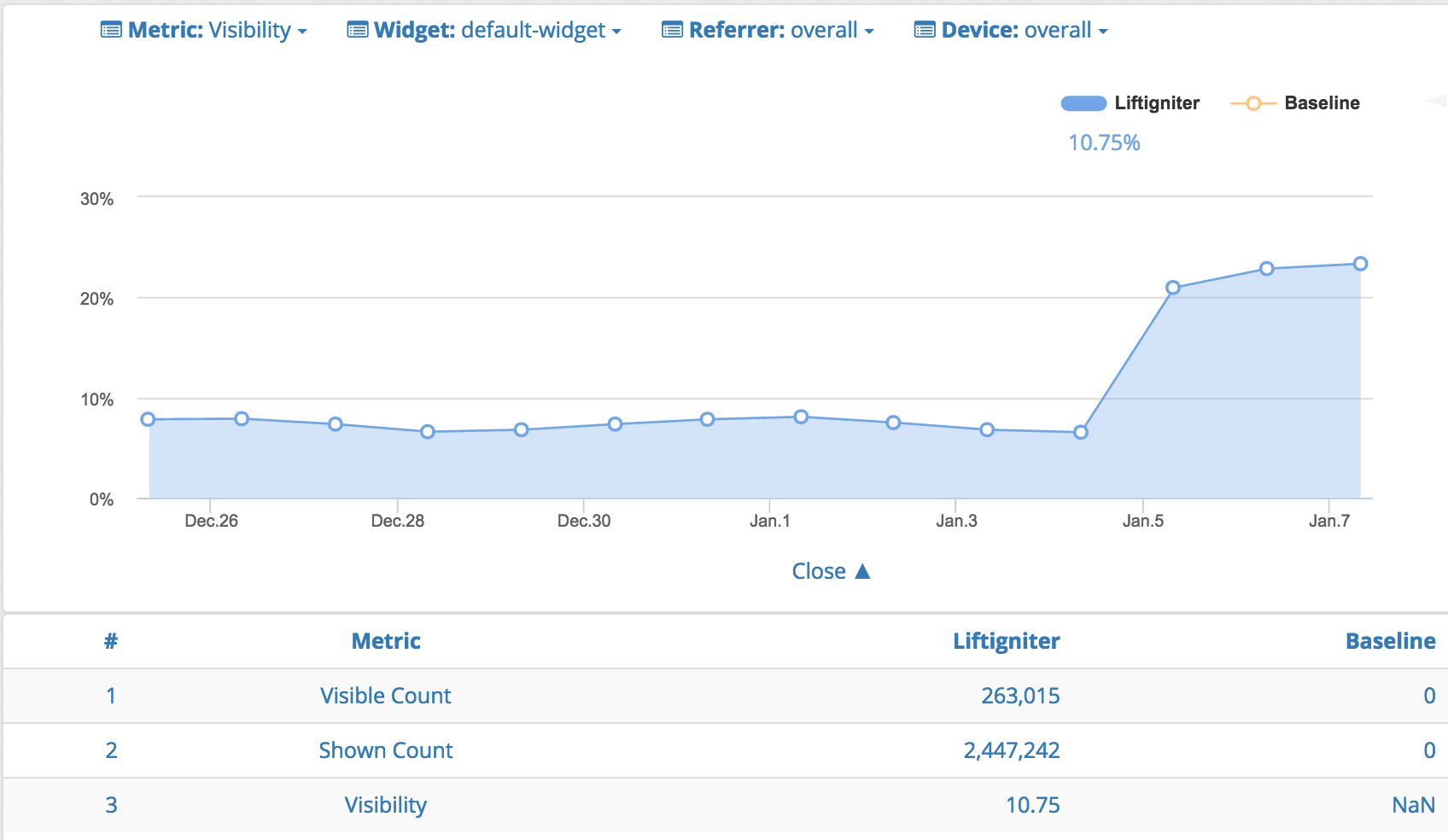
It turns out that the increase can be explained primarily due to increased visibility, which suggests it was due to a change in the widget placement (which it was).
The role of recommendation styling
Below are some general heuristics on recommendation styling.
- Title and image: The two key fields that most users care about (on most sites) are title and image. Having one or both these fields missing can hurt performance. Recommendations without images, or with broken images, see about half the CTR of recommendations with images. Slow-loading images can also hurt recommendation performance.
- On e-commerce sites, including price information generally reduces CTR. This is because people often click on items just to learn about the price. However, it may still be worthwhile to show the price to improve the user experience, and because the effect on CTR will anyway get canceled when looking at final conversion rates.
- Review counts and ratings can make for a better user experience. They may affect CTRs but that can vary from site to site.
With the exception of making sure to include a title and image, we recommend making choices that go well with your desired user experience rather than trying to optimize for CTR. With that said, if your styling changes have a significant impact on CTR (which happens occasionally) you may need to factor that in and may decide to revert your change.
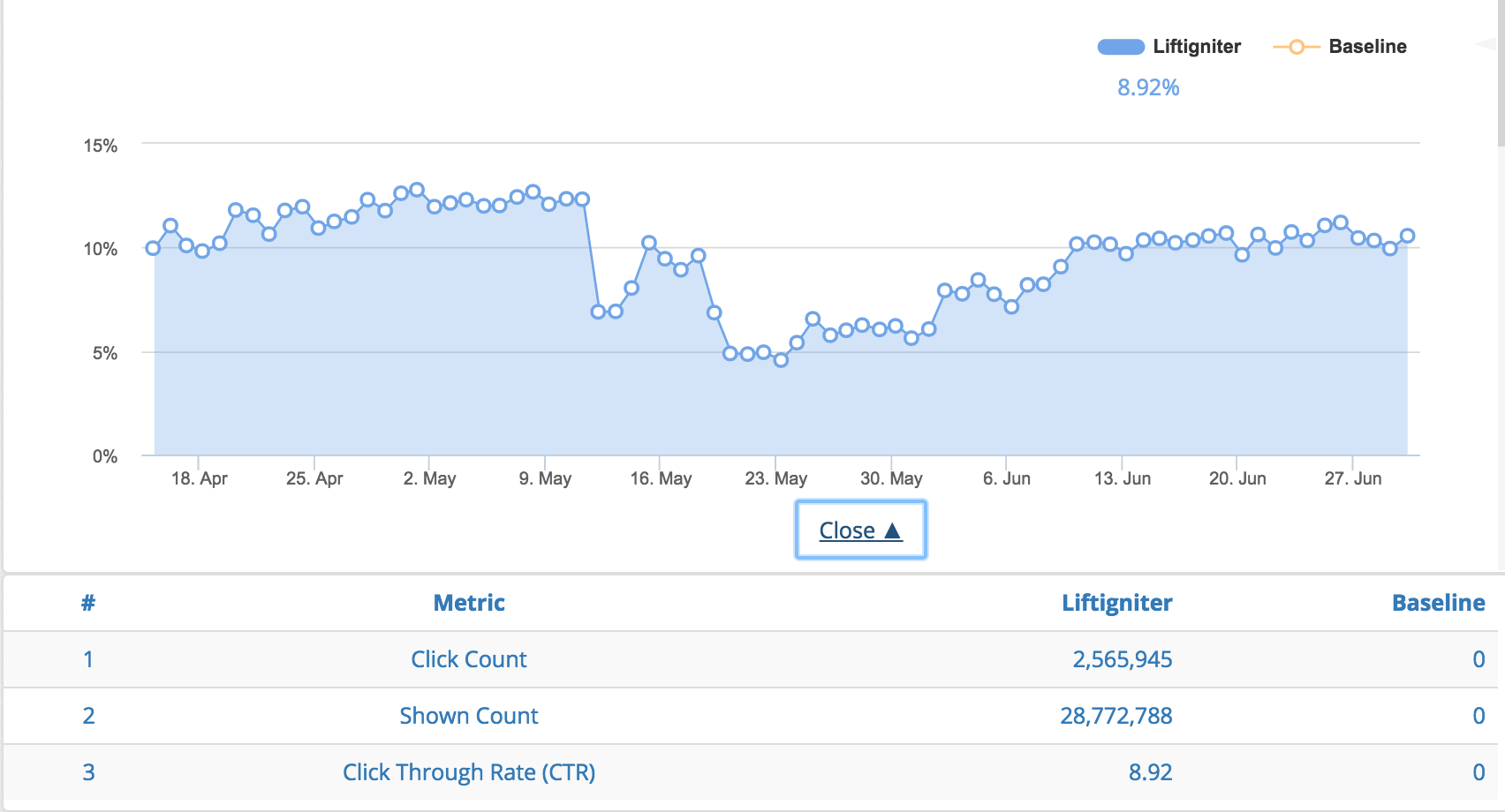
A recommendation styling change by a website using LiftIgniter recommendations causes CTR to drop significantly. CTR recovers after the styling change is reverted.
Value range for CTR
As discussed above, CTR can vary quite a bit based on the website, recommendation quality, placement, and styling. For our recommendation widgets, we see a wide range in performance, going all the way from 0.1% to 30%. Note that external recirculation units usually have CTRs of 0.5% or lower, although external recirculation to qualitatively similar sites (rather than obvious "advertising") can have higher CTRs.
Here are some heuristic ranges. Note that the situation can be quite different for your website.
| Content type | Recommendation placement | CTR range |
|---|---|---|
| Video (with video recommendations) | Right rail | 5% to 50%. Note that CTRs can be lower if people become used to an "autoplay" experience or to using end-of-video recommendations instead. |
| Video (with video recommendations) | End of video (on video screen) | 10% to 100% times completion rate for videos. |
| Slide show (with slide show recommendations) | Right rail | 2% to 20%. It's lower than for videos. |
| Slide show (with slide show recommendations) | End of slide show (on slide show screen) | 10% to 100% times completion rate for slide shows. |
| Article pages | Right rail | 0.5% to 10%. The CTR here heavily depends on the number of items shown and whether ads obfuscate the recommendations. The higher range is seen in cases where you have 10+ recommendations, they include titles and images, and there are no ads in the column. |
| Article pages | Just below the article (not separated by an external recirculation unit) | 2% to 20%. Usually 10% to 100% times the article completion rate. |
| Article pages | Below the article (but with an external recirculation unit in between). | 0.2% to 5%. Much lower than for just below the article, primarily due to decreased visibility. |
| Product pages | Below the product description (but above detailed review) | 2% to 20%. |
| Home page | Based on location | 0.2% to 30%. Heavily dependent on location, number of items, and user consumption patterns. |
