The Visible Click-Through Rate (VCTR) of a recommendation widget is calculated as follows:
Visible Click-Through Rate (VCTR) = (Number of times the widget was clicked)/(Number of times the widget was visible)
It is usually expressed as a percentage, so you'd have to multiply the above number by 100.
In order for this metric to work, you need to make sure that you have enabled widget tracking. If using a custom tracking function, you need to implement your own visibility logic.
The three determinants of VCTR: recommendation quality and count, placement, and style
VCTR is determined by three key factors. The goal is for you to outsource (most of) 1 to LiftIgniter, while retaining control of 2 and 3.
- The selection of recommendations. This is where you use a powerful engine like LiftIgniter. More personalized and contextually relevant recommendations do better. One parameter you can vary is the number of recommendations. In general, more is better, and the ideal range is generally somewhere between 3 and 12 recommendations.
- The placement of the recommendations. The relation between placement and VCTR is complicated. In general, VCTR is higher in the left column than in the right column, and also higher the farther down the recommendations are on the page (this is a bit counterintuitive, so see the explanation in the section below).
- The style of the recommendations, including what metadata is displayed. This is covered in more detail in a later section.
Comparing VCTR values in an A/B test
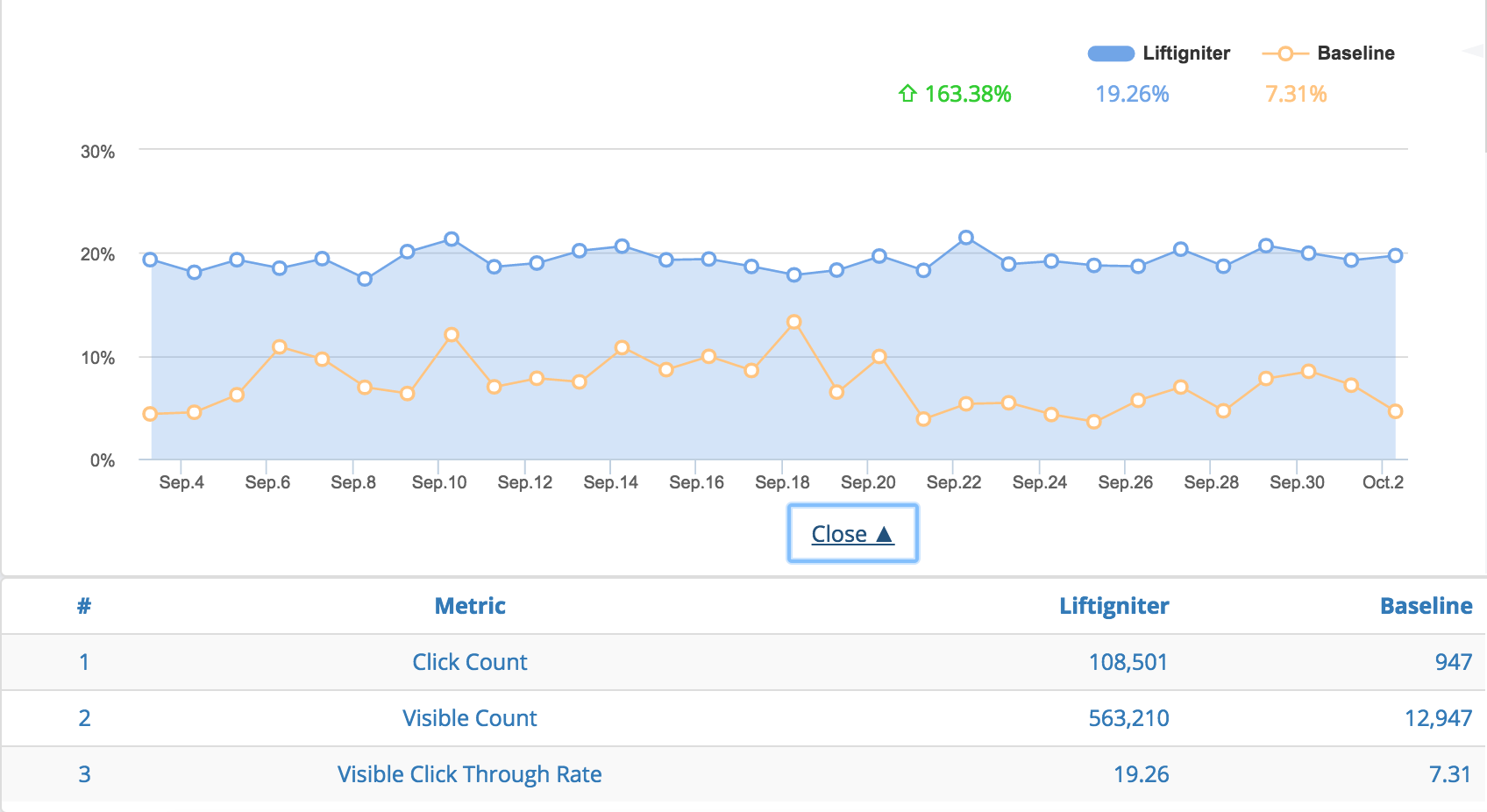
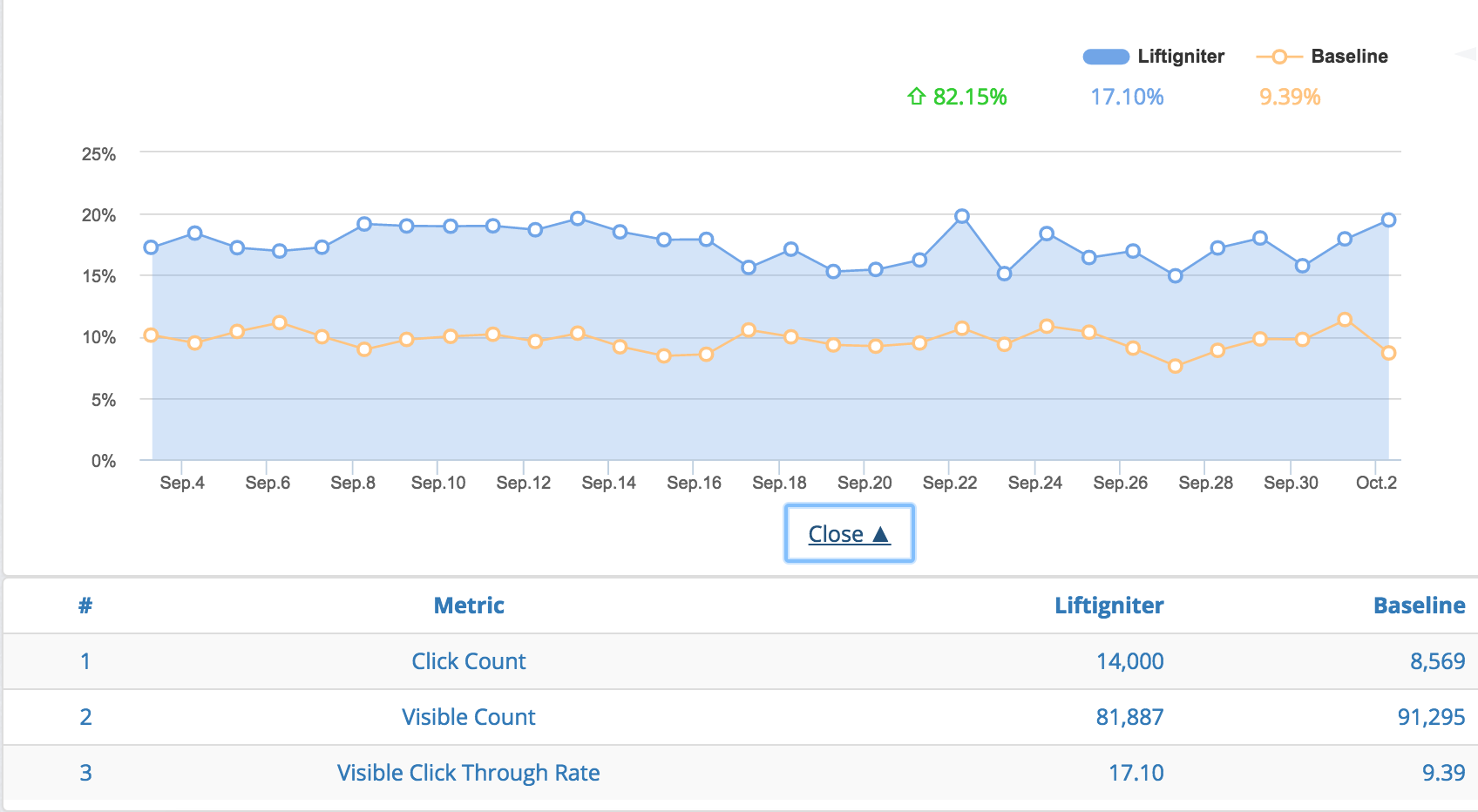
The VCTR is one of the fairest metrics to use when comparing relative performance in an A/B test between LiftIgniter recommendations and the baseline recommendation system you are testing it against. In the Analytics tab of our dashboard, you'll see graphs of LiftIgniter's VCTR (blue, filled solid) and the baseline CTR (orange). If we're doing our job, the blue line will be clearly above the orange line. The percentage lift represents how much we are adding relative to the baseline.
One potential issue with VCTR is that it fails to capture differences in visibility that can be driven by user habit formation: users who are shown better recommendations may be more likely to scroll down the recommendation section. However, this effect is small at launch time and therefore can be ignored during an initial A/B test.

VCTR comparison for an A/B test. Note that this is NOT a 50/50 A/B test, as the base slice is much smaller. Data is for a post-trial customer who kept a base slice for continued benchmarking.

VCTR comparison for a 50/50 A/B test.
How the number of recommendations affects VCTR
We see that increasing the number of recommendations increases total VCTR in the area, as people have more options to choose from. However, the increase is usually less than proportional. For instance, doubling the number of recommendations will increase VCTR, but to less than double of the original value. That's because of three reasons:
- Reduced relevance: The top few items we show tend to be the best. So as we increase the number of items, the average quality of the item (for the user context) tends to go down.
- Reduced visibility of items: The more recommendations you put in, the larger the widget gets, and the less likely it becomes that a user sees all the recommendations. For instance, if you are showing 20 recommendations on a right rail for a video, people are likely to see only the top 5 or 6 recommendations that are visible above the fold, so the remaining recommendations aren't that valuable.
- Cannibalization between items: Some users are interested in clicking something but don't have a strong preference regarding what to click. These users, who were anyway predisposed to click, don't become more predisposed to click on seeing more items. For instance, somebody who is keen to read another article, but not too particular about what article to read, may not be that much more likely to click with 6 options than with 3.
The role of placement in determining VCTR
To understand the role of placement in determining VCTR, it's helpful to revisit the formula.
VCTR = (Number of times the widget was clicked)/(Number of times the widget was visible)
The denominator count of "visible" only refers to the recommendation widget entering the viewport, and does not mean the widget was actually noticed by the user.
There are two thumb rules for VCTR:
- Locations farther down the page have higher VCTR: People who have scrolled that far down are often more determined to click. Note that they could still have pretty low overall CTR, because the visibility could be fairly low.
- Generally, locations on the left side of the page (where the main piece of content is available) tend to have higher VCTR. This is because people pay more attention to the left side of the page. For instance, on article pages, the location just below the article has high VCTR, whereas right rails have very low VCTR.
The role of recommendation styling
Below are some general heuristics on recommendation styling.
- Title and image: The two key fields that most users care about (on most sites) are title and image. Having one or both these fields missing can hurt performance. Recommendations without images, or with broken images, see about half the CTR of recommendations with images. Slow-loading images can also hurt recommendation performance.
- On e-commerce sites, including price information generally reduces VCTR. This is because people often click on items just to learn about the price. However, it may still be worthwhile to show the price to improve the user experience, and because the effect on VCTR will anyway get canceled when looking at final conversion rates.
- Review counts and ratings can make for a better user experience. They may affect VCTRs but that can vary from site to site.
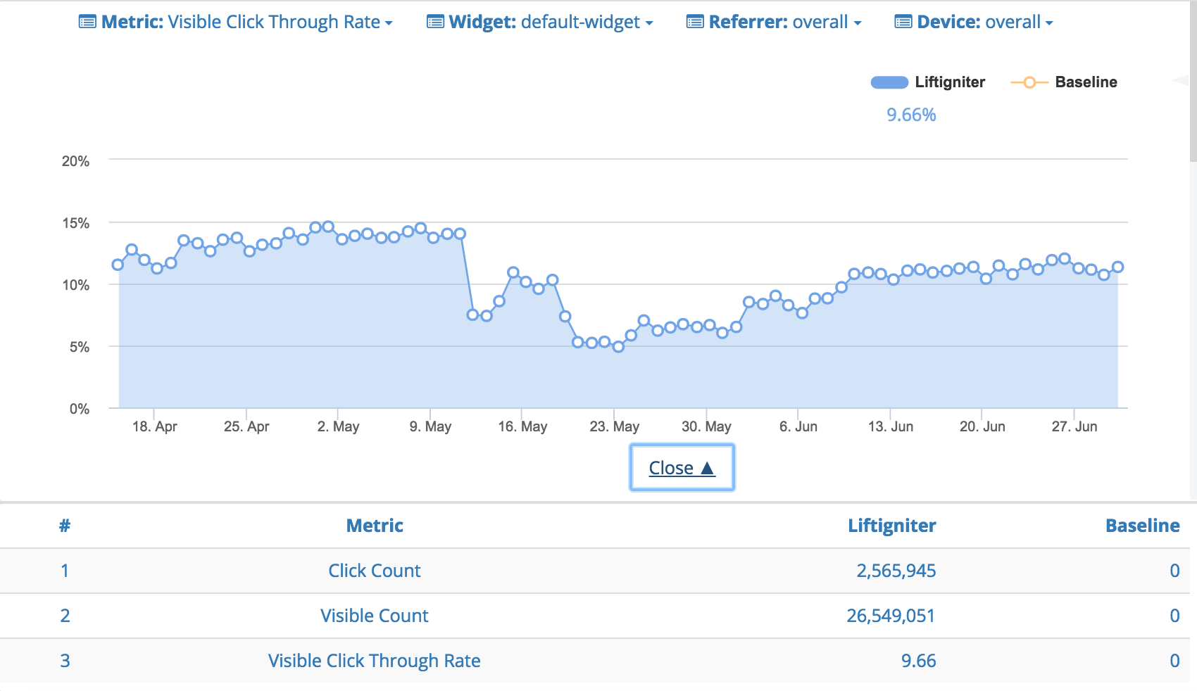
With the exception of making sure to include a title and image, we recommend making choices that go well with your desired user experience rather than trying to optimize for VCTR. With that said, if your styling changes have a significant impact on VCTR (which happens occasionally) you may need to factor that in and may decide to revert your change.

A recommendation styling change by a website using LiftIgniter recommendations causes VCTR to drop significantly. VCTR recovers after the styling change is reverted.
Value range for VCTR
As discussed above, VCTR can vary quite a bit based on the website, recommendation quality, placement, and styling. For our recommendation widgets, we see a wide range in performance, going all the way from 1% to 100%. Note that external recirculation units usually have VCTRs of 3% or lower, although external recirculation to qualitatively similar sites (rather than obvious "advertising") can have higher VCTRs.
| Content type | Recommendation placement | VCTR range |
|---|---|---|
| Video (with video recommendations) | Right rail | 5% to 50%. Note that CTRs can be lower if people become used to an "autoplay" experience or to using end-of-video recommendations instead. |
| Video (with video recommendations) | End of video | 10% to 100%. This is assuming that the "visible" event is triggered only on completion (when the end recommendations become visible). |
| Slide show (with slide show recommendations) | Right rail | 2% to 20%. It's lower than for videos. |
| Slide show (with slide show recommendations) | End of slide show (on slide show screen) | 10% to 100%. This is assuming that the "visible" event is triggered only on completion (when the end recommendations become visible). |
| Article pages | Right rail | 0.5% to 10%. The VCTR here heavily depends on the number of items shown and whether ads obfuscate the recommendations. The higher range is seen in cases where you have 10+ recommendations, they include titles and images, and there are no ads in the column. |
| Article pages | Below the article (either immediately below or separated by ads) | 5% to 50%. Note that separation by ads does not reduce VCTR, but it reduces CTR through decreased visibility. |
| Product pages | Below the product description | 2% to 20% |
| Home page | Based on location | 2% to 50%. Locations further down the page tend to have higher VCTRs, but lower CTRs due to reduced visibility. |
